Design Portfolio Review
Jon Kerr
Hello there! I’m Jon, Interdisciplinary Designer & Consultant with 7+ years helping organizations strategize, build and scale their digital experiences.
Product Design
Design Strategy & Ops
Research & Testing
Prototyping
Agentic & Generative Ai
Design Systems


Let's Talk

Tim Hortons Digital
Redesigned a loyalty and ordering app serving Canada's largest quick service restaurant's 8M+ users into a connected digital ecosystem that drives 5+ user touch points daily.
Role
Design Lead
Team
1 Design Director
1 Design Lead
2 Junior Designers
1 Copywriter
Engineering
Product (PO / PM)
Year
2022

The Problem
Prior to the redesign Tim Horton's online presence consisted of a basic site, low social media activity (sub 1% engagement) and poor mobile optimization despite 60% off traffic originating on phones

High Bounce Rate
The existing experience had a 75% bounce rate

Short Sessions
Session durations of only 1.2 minutes

Competitive Disadvantage
67% of Canadian consumers were actively using competitor apps
The Task
Design, test, and develop the complete redesign of Tim Hortons core app experience for the 4.5+ million monthly users. The design team focussed on 6 key areas to build a new ecosystem.
Design System
Establishing a design system that aligns to the digital experiences new branding & visual guidelines.
Homepage
Redesign the homepage experience & information architecture to improve the navigation of the app.
Scan & Pay
Optimize the scan and pay feature that allows users to seamlessly utilize the app.
Onboarding
Lower barrier for entry with a seamless account creation & onboarding process.
Performance
Improving the performance of offers & gamification of challenges to increase sales.
Features
Establish the foundation for fast-follow features: financial service, games centre, community page, & eCommerce shop.
The Approach & Deliverables
My design approach involved understanding the problem through researching, defining personas, iterating and prototyping designs with usability testing and collaborating with cross functional teams to deliver a redesign of the mobile ecosystem.

Discover
Tasks
20+ client co-creation sessions
30+ user research sessions
2 team members onboarded
Outputs
Define business goals & product vision
Current state heuristic evaluation
Landscape research findings & opportunities deck

Define
Tasks
Feature prioritization session; business + user benefits, technical feasibility
Define roadmap & scope
Outputs
4 customer mindsets created
5 design principles identified
7+ current state user flows & journey maps
5 features prioritized for MVP

Design + Test
Tasks
2 Week sprints
35+ usability testing sessions
Deploying DesignOps across pods
Outputs
100+high-fidelity mockups & prototypes
5 future state user flows
1 site-wide information architecture map
Design doc templates, testing protocol, insights synthesis, & minutes template.

Deliver + Measure
Tasks
Weekly QA sessions with 1:1 design & dev
Tagging UI assets to measure performance on Amplitude.
Outputs
226 design bugs resolved pre-launch
Streamlined enterprise design & delivery process
New design system
Backlog of fast-follow features.
Key Results

Increase in performance of offers (activation & use)

Increase in purchases within 6 months of launch

Successful sign-ups within 1 month of launching
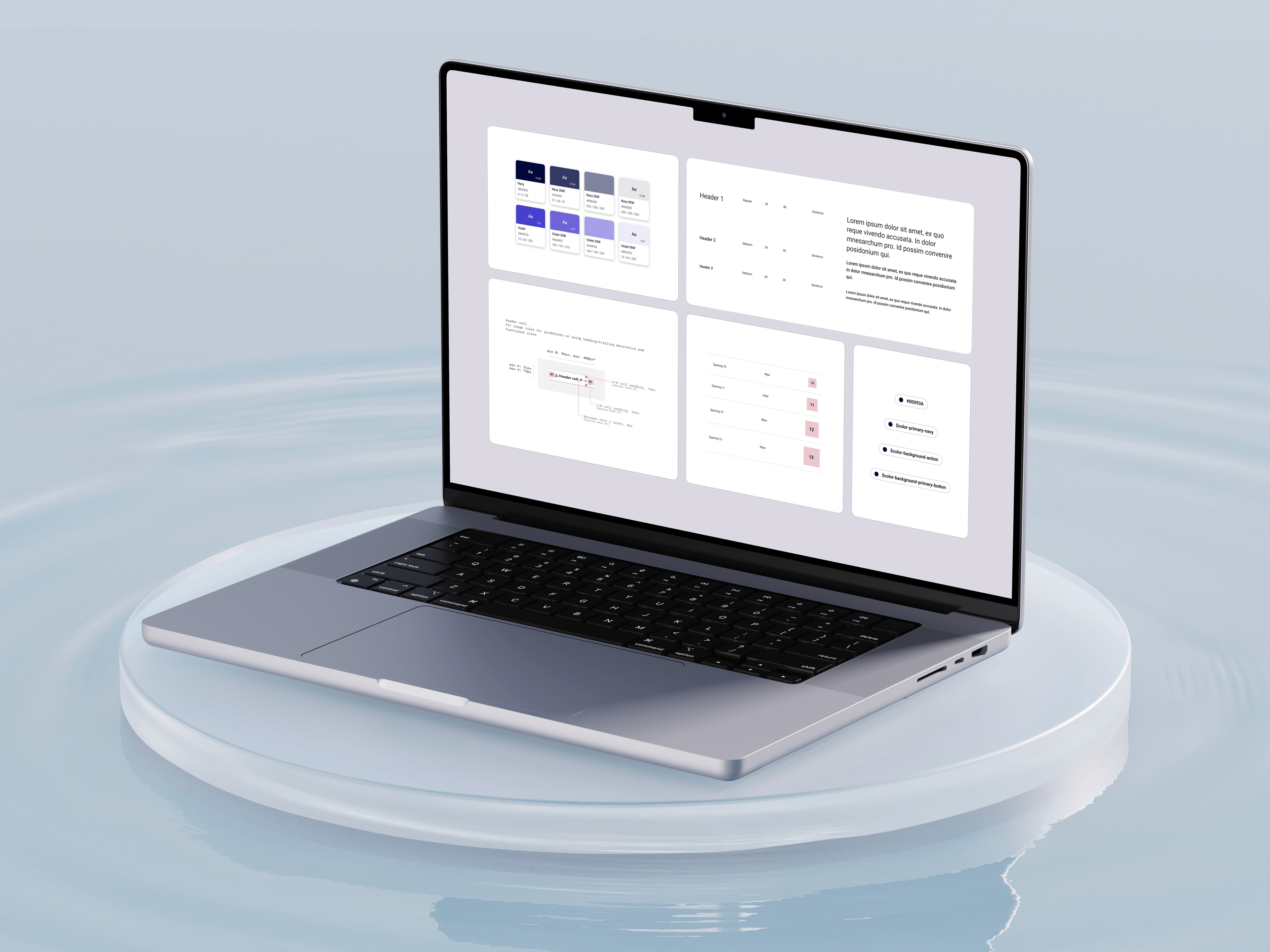
The Design System
I worked with the design system team to create scalable, accessible, and visually appealing components for the design system ensuring visual cohesion across all the digital experiences.

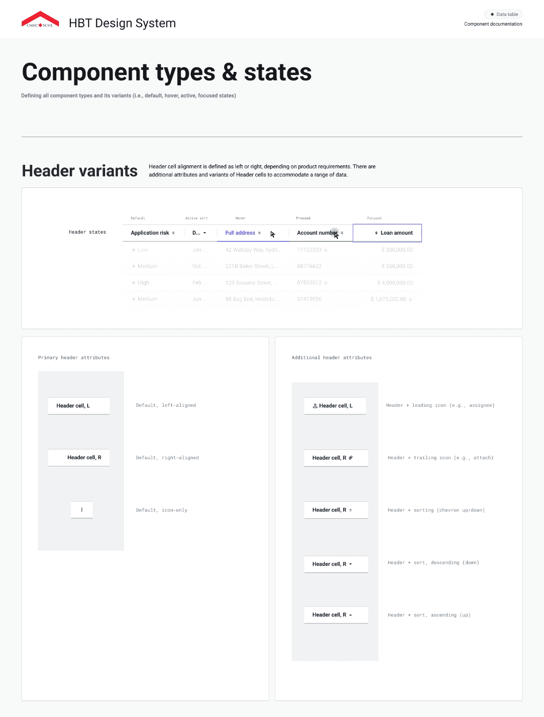
Component Composition
Figma's component system empowered our designers through features like master components, variants, tokens, spacing and boolean properties.
Creating well-structured components with thoughtful variant sets and boolean switches allows for flexible, consistent design implementation.
This approach reduces redundancy and enables rapid prototyping while maintaining design cohesion across the project.

Interaction Documentation
Comprehensive documentation is the backbone of any effective design system.
Well-crafted documentation serves as a single source of truth that aligns team members and accelerates onboarding.
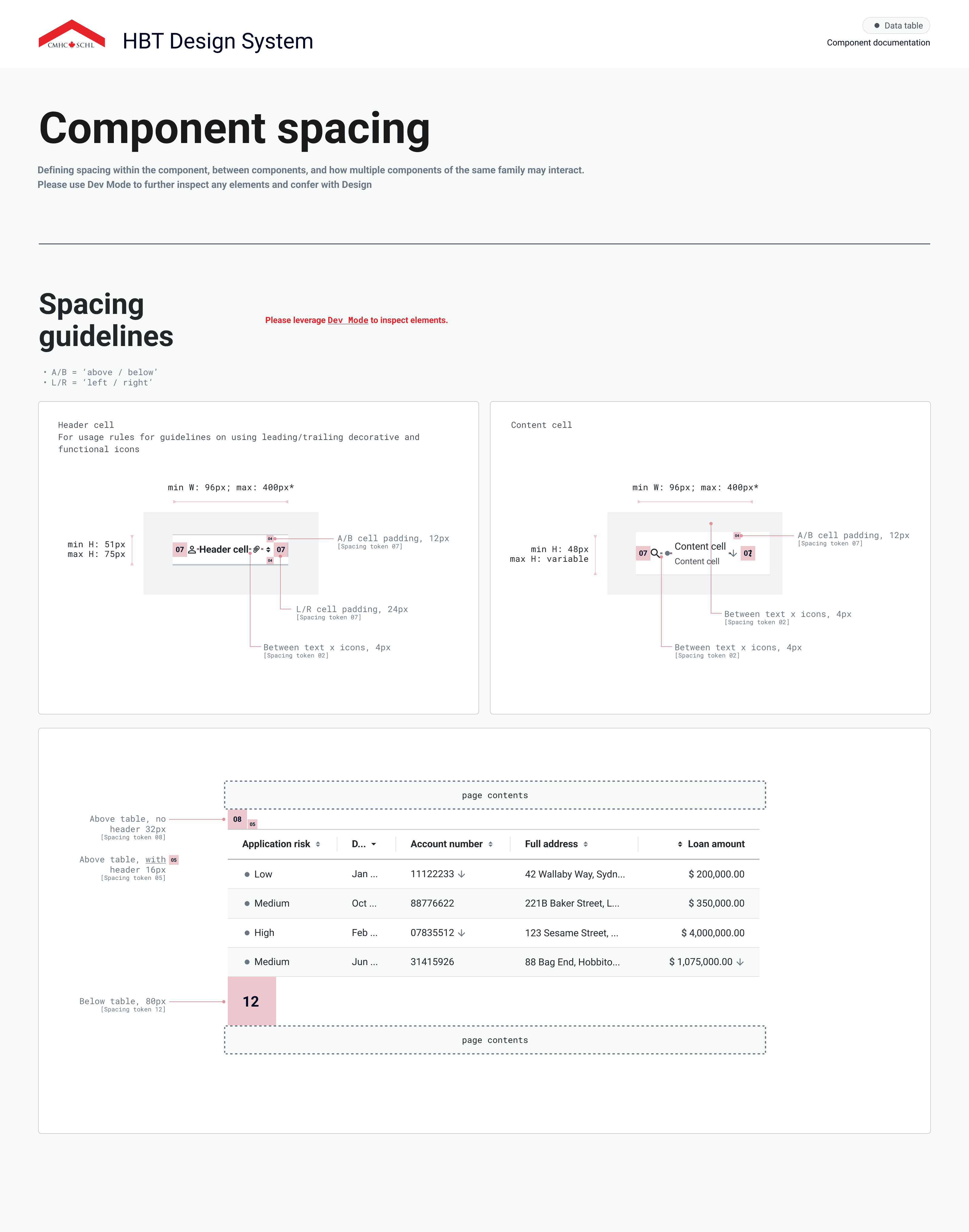
Include detailed component specifications, usage guidelines, and implementation notes that bridge design and development. Documented component behaviours, responsive considerations, and state changes to ensure consistent implementation.

Accessibility
WCAG compliance requires meticulous attention to accessibility details in component design.
This includes maintaining color contrast ratios of at least 7:1 for normal text, ensuring keyboard navigability for all interactive elements, and providing multiple ways to access content.
Components should include proper semantic structures, sufficient focus indicators, and text alternatives for non-text content to create truly inclusive experiences.
Design System Foundations


Homepage
Our redesign prioritized the homepage as both the entry point and navigational hub for mobile app users.
User interviews revealed the need for a clean interface that avoids the endless scrolling caused by oversized media cards in the current design.
Participants engaged in research studies
Collaborative sessions were held with stakeholders
Low fidelity wireframes were developed to experiment
High fidelity concepts were created to finalize vision


The Problem
The current state experience navigation is restrictive in that there is no room to add new destinations, forcing an over-reliance on homepage tiles that compete for user attention.

Best Practices
Best practices dictate the bottom navigation is king. It is the most ergonomic and exists as a known pattern for navigating primary destinations across both iOS & Android.
Risks to Consider
Feature Demotion
Bottom navigation might force the demotion of certain function and features that are bulk grouped into the "more" tab.
User Engagement
Monitor decrease in user engagement for core features that will be affected by homepage redesign (e.g., Offers and challenges, mobile order & pay, loyalty). If over 2% = At risk
Research & User Testing
A navigational redesign requires us to validate our decisions with testing since we are moving core functionality without user consent (offers).
Exploration
Benchmarks and problem statements considered during co-creation sessions

Personalization
How Might We:
Personalize an experience for users and make their time in-app more convenient?
Recommendation:
Create an initial personalized navigation model leveraging onboarding + mindsets. Further refine the experience for the user through their behaviour + leveraging value drivers.

Engagement
How Might We:
Drive users to new experiences and increase engagement?
Recommendation:
Shift users’ mental models to adapt to this new navigation pattern, layering in additional functionality over time.

Navigation
How Might We:
Modify our current navigation patterns to create an immersive experience some moments and provide firm navigational clues at others?
Recommendation:
Define a set of rules that allow for the bottom navigation to appear or disappear and rely on top bar navigational elements to enable navigation through a series of hierarchical screens.
Initial Wireframes
Following multiple co-creation workshops and focused ideation sessions, we produced and refined our initial wireframes for the homepage.

Design Research and Validation
Moderated and unmoderated research via Usertesting.com conducted over 2 months validated that customers understood the purpose of the new homepage, how to navigate to the core features, and how to seek help if needed.
Moderated usability testing:
Participants completed 4 tasks from the home page and answered follow-up questions.
Task completion: could users still perform key tasks effectively?
User perception: how did users react to the new navigation structure?
Unmoderated usability testing:
Participants interacted with 4 versions of the home page with pre-determined and AI-generated prompts.
Home page preference: which version of the home page do participants prefer?
Tims+ interaction: does the swipe-up drawer design feel intuitive and useful to users?

Synthesizing Insights
To distill key findings, we leveraged data-driven synthesis techniques:
Task difficulty assessment:
Participants rated tasks on a 1-7 scale, revealing usability friction points and areas for improvement
AI-powered analysis:
Testing sessions were transcribed and tagged in Dovetail, allowing us to extract key pain points, user behaviors, and recurring feedback
Pattern recognition:
Through affinity mapping, we categorized insights into themes, enabling a clear roadmap for design iteration
This structured approach transformed raw user data into actionable design decisions, ensuring a research-backed evolution of the app experience.


Rethinking Interaction: When Swiping Didn’t Work
During testing, we anticipated that users would intuitively swipe up to access the Tims+ drawer;
(A) Instead of swiping, most users instinctively tapped, treating it as a standard button interaction.
(B) Some missed the feature entirely, reducing engagement with Tims+ offers.
This unexpected insight challenged our design assumptions and led to a key redesign (see concept B below on the right):


Introducing a visible tap to open "Tims+" CTA on the bottom navigation bar, making the feature more discoverable and significantly improving user interaction.
High Fidelity Mockups
To develop the high fidelity designs for our app, we followed a thorough process of testing and improvement over 4 months to simply processes, clean up the UI, and account for possible edge cases.
Finally, with the improved designs in place, we successfully launched the app, providing users with an intuitive and enjoyable experience of their favourite that led to a 16.4% increase in purchases since 6 months of launch.

Payment Methods
Redesigning scan and payment methods for seamless transactions
Most users scanned to redeem offers and earn rewards but still paid with cash or card in-store. Few adopted in-app payments.
Our goal: streamline checkout time with Scan & Pay using one QR code to earn points & pay simultaneously using a saved credit/debit card on the app.

The Challenge
Adding cards was confusing and adoption was low.
The Scan & Pay feature and redesign of the current payment methods page came from a goal to increase mobile order & pay by 7% in the next year.
The Approach
Mapped all payment touch points in the app,
Built universal payment components for consistency across the app
Redesigned Payment Methods page for clarity & accessibility

The Research
Do users see the benefit of Scan & Pay and will they use it on a daily basis?
Are users able to easily navigate and activate Scan & Pay?
Are users able to efficiently add a new credit/debit card to the account ?
Design Validation
A/B Testing
2 final concepts prepared for unmoderated A/B testing.
6 user groups tested to study purchase routines & app usage patterns.
Study Findings
Current users confirmed they would add a credit card for Scan & Pay.
Users preferred leveraging the scan and pay method over adding a payment method.

Key User Testing Insights & Feedback
/
Participants were very likely to use their mobile app with Scan & Pay toggled on
/
Participants successfully activated the scan & pay feature in prototype B
All users successfully completed it in prototype A
/
Tim Card only users prefer to continue using Tim Card as their payment method of choice in-store and for mobile purchases
/
Participants prefer prototype A with a separate tab for Tim Card, equally preferred regardless of current payment preference (in-store or mobile)
Frictionless
I wont forget to earn points when paying with a card from now on
Known Behaviour
QR usage has become more familiar during the pandemic, i don't see an issue with this approach
Ease
Taking a 2 - step process into a single-step process is going to make my day better
Save Time
It's just faster, that's a no-brainer. I don't know why Tim Hortons hasn't done it already
Prioritizing for Impact
Redesigning the payments method process was secondary outcome of introducing scan and pay.
High-level Goal of Iteration
Simplify adding and managing payment methods on the Tims app using new DS components with minor UX upgrades.
Notable Changes
Removed “set default card” (only 0.9% of users used it)
Default = last used payment method
Introduced smart defaults (e.g., Apple/Google Pay in checkout)
Post-launch considerations
Measure user satisfaction on setting defaults through transactions (scan or mobile order) vs. on payment method settings.
Revisit design of not showing defaults on payment method settings if >2% of users are reporting confusion via feedback.
Payment Prototype
The Goal: Keep interactions simple, focused, and user-friendly:
Introduced expandable bottom sheets for adding & managing payment methods.
Designed with medium + full detents to support flexible content.
Ergonomic focus: easy single-finger navigation and quick dismissal.
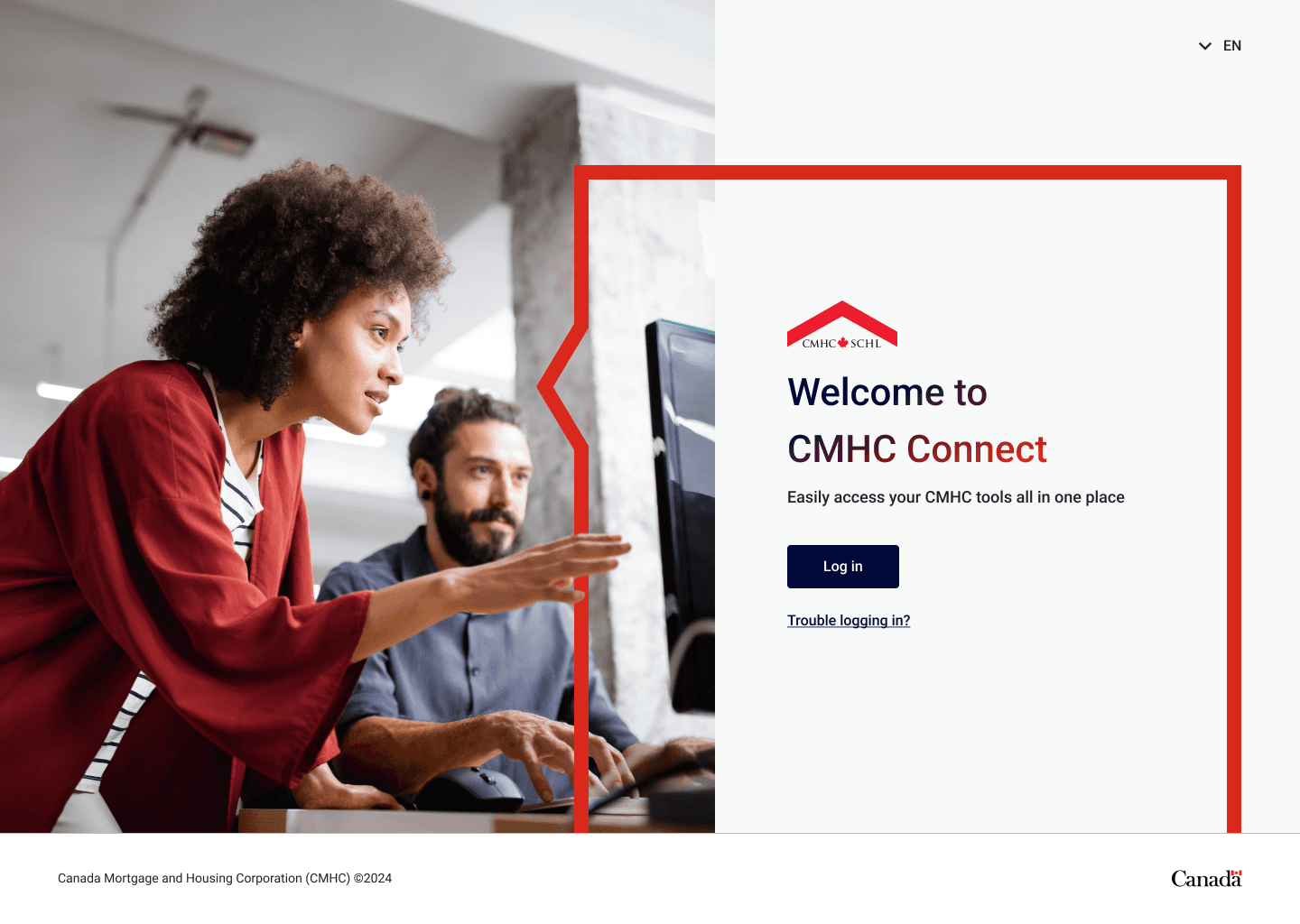
CMHC Design
I lead the implementation of various design initiatives for Canada's national housing agency - which include Enterprise DesignOps, HBT Design System, product design delivery lead.
Role
Principal Designer
Team
Design Director
Principal Designer
2 Senior Designers
2 Junior Designers
Product (PM / PO)
Engineering
Year
2024
The Task
In 2024, the client initiated the revamp of the CMHC Connect platform, I was responsible for various key tasks throughout the readiness and deployment phases.
DesignOps
Structured 0-1 Figma Enterprise workspaces, onboarded designers, documented SOPs, and acted as SME in cross collaborative teams.
Design System
Established a 0-1 design & token library to scale across multiple products, uphold design standards & establish design governance.
CMHC Connect
Guide design teams during design sprints for Operations, Mortgage Lender Insurance, Portfolio & Servicing products.
The Outcome
The successful implementation of HBT Design System and various DesignOps practices contributed to the implementation of the CMHC Connect platform, providing the framework for other lines of business to utilize the libraries and scale their design teams.


HBT Design
Behind the Scenes…
Shaping How Designers Work
In 2024, the client initiated the revamp of the CMHC Connect platform, I was responsible for various key tasks throughout the readiness and deployment phases.
The Challenges
CMHC was transitioning from Sketch to Figma & had no enterprise license or workspace established.
CMHC was shifting to Agile & was undergoing training during deployment phases.
No Design SOP's have been established between cross collaborative teams.
The Solutions
Implement Figma Enterprise workspaces for multiple lines of business & a standardized design system.
Facilitate regular touch points between cross-collaborative team
Develop documentation and procedures during product development cycles for design, dev, QA, product teams.
Design Playbook
I developed CMHC's design playbook for interacting with Product, Development, & QA teams, ensuring product designers were engaged in various stages of the product development cycle, from intake to delivery.
Design Ops Playbook


Figma Libraries to Support Web & Mobile
Web and Mobile libraries were created, delivering multiple benefits to designers, including reduced file size, a well-structured library for focused design needs, improved analytics tracking, and an optimized variant panel.
Web (React) & Mobile Libraries
Custom components & variables
Digital users leveraging library
Implementing Design Guidelines for All
Hundreds of digital teams use HBT on a daily basis, including product designers, developers, BAs / PMs and QA. Our guidelines include detailed specifications about the master components, variants, property specifications, spacing, types / states, rules, and accessibility.


Designing for Accessibility & Inclusion
At HBT, we upheld high accessibility standards to ensure our digital products were usable by all Canadians. Our design system team partnered with a dedicated accessibility SME to embed accessibility into every stage of development.
Keyboard Controls
Tab
Q
Shift
Z
Focus State
Button
Colour Contrast

WCAG AA: Pass
Screen Reader

Key Practices Include
Meeting WCAG requirements for colour contrast, keyboard navigation, screen reader compatibility, and focus states.
Integrating accessibility criteria directly into Figma documentation for each component, making inclusive design guidelines easy to adopt and reference.
Governance & Scaling the System
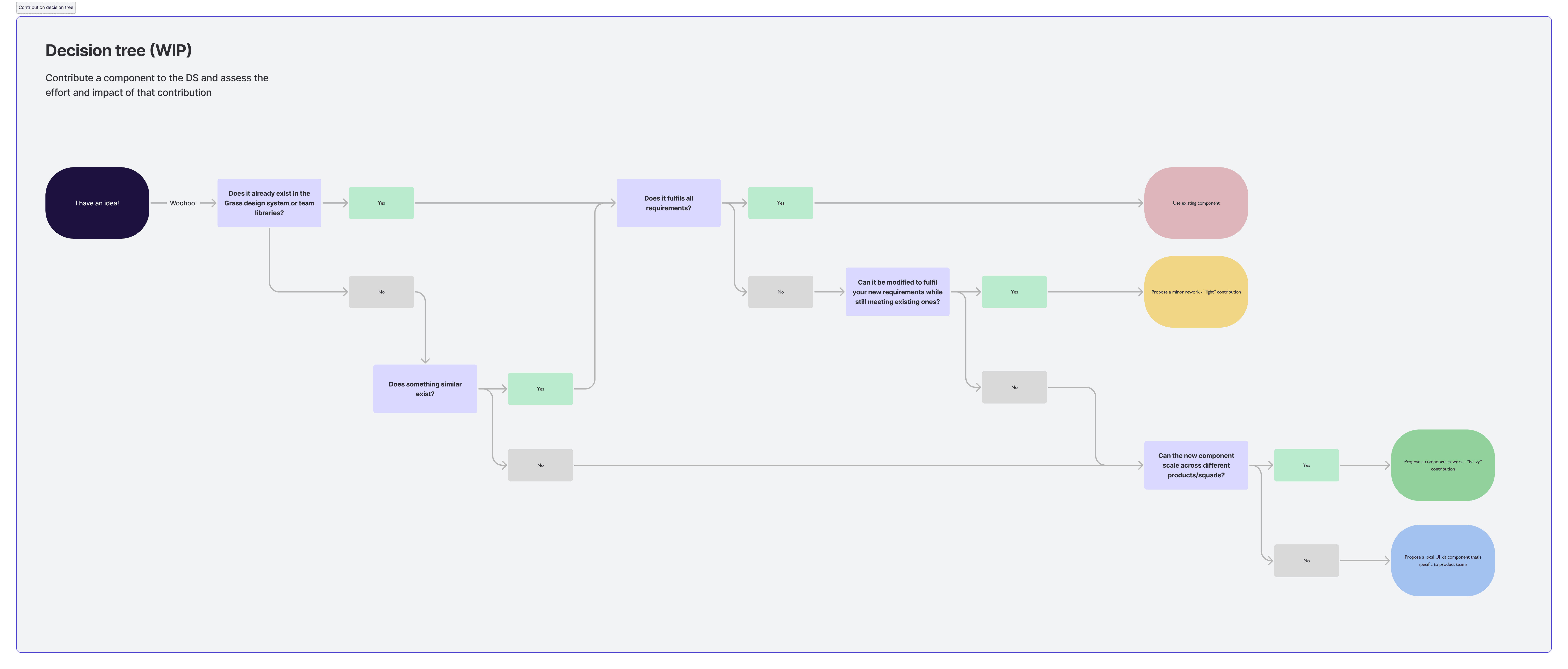
The design team adopted a contribution model to expand the design library, enabling both designers and developers to propose and refine components. This bridged gaps between existing and emerging needs while maintaining governance and quality standards.
The Challenges
Limited DS resources split between system + product delivery
Need to support evolving branding + component demands
The Approach
Adopted a contribution model so designers/devs could propose + refine components
Established guidelines + governance for quality and consistency
Introduced a token library to centrally manage themes + branding
The Solutions
Design team became an extension of product teams instead of sole maintainers
Scaled system adoption across lines of business
Enabled consistent yet flexible branding as organizational needs grew
Collaboration Process
Token Library

Collaboration & community
Cross collaboration and communication with the development team was crucial to ensuring successful implementation of HBT. The HBT team established various design rituals and resources to coordinate efforts strategically across product teams.


Key Practices Include
Established daily standups for alignment, blockers, and problem-solving
Led onboarding & training sessions to ramp up new team members
Organized developer syncs & demos to ensure implementation success
Created a Teams channel for ongoing cross-functional support
Leveraged Azure DevOps for transparency and shared access to project info
Example Design System Templates


Let's Talk