
HBT Design System
HBT Design System
HBT is the foundation of CMHC for elevating beautiful, standardized, and accessible designs and front-end digital products from our communities into reusable elements, promoting autonomous and collaborative culture to nourish a unified design system.
HBT is the foundation of CMHC for elevating beautiful, standardized, and accessible designs and front-end digital products from our communities into reusable elements, promoting autonomous and collaborative culture to nourish a unified design system.
HBT is the foundation of CMHC for elevating beautiful, standardized, and accessible designs and front-end digital products from our communities into reusable elements, promoting autonomous and collaborative culture to nourish a unified design system.
Client
Client
Canada Mortgage and
Housing Corporation (CMHC)
Canada Mortgage & Housing Corporation (CMHC)
Canada Mortgage and Housing Corporation (CMHC)
Year
Year
2024
2024
Role
Role
Principal Designer
Principal Designer
Overview
Overview
Create HBT library to support launch of new internal tools
In 2024, the client initiated the revamp of the CMHC Connect platform. In the readiness phase, I structured the Figma enterprise architecture to enable dedicated workspaces for various product teams and access to foundational, component and extended libraries.
I led the development of the HBT design & token library to uphold the new design standards, establish consistent components and a unified design style compatible with the latest framework.
HBT was developed and first adopted by the Operations, Mortgage Lender Insurance, Portfolio, & Servicing product teams for production. I worked within the delivery pods, in addition to managing the libraries.
Products using HBT


HBT Design System
HBT Design System
How we did it…
How we did it…
Design Scope
Design Scope
Shaping how designers work
Shaping how designers work
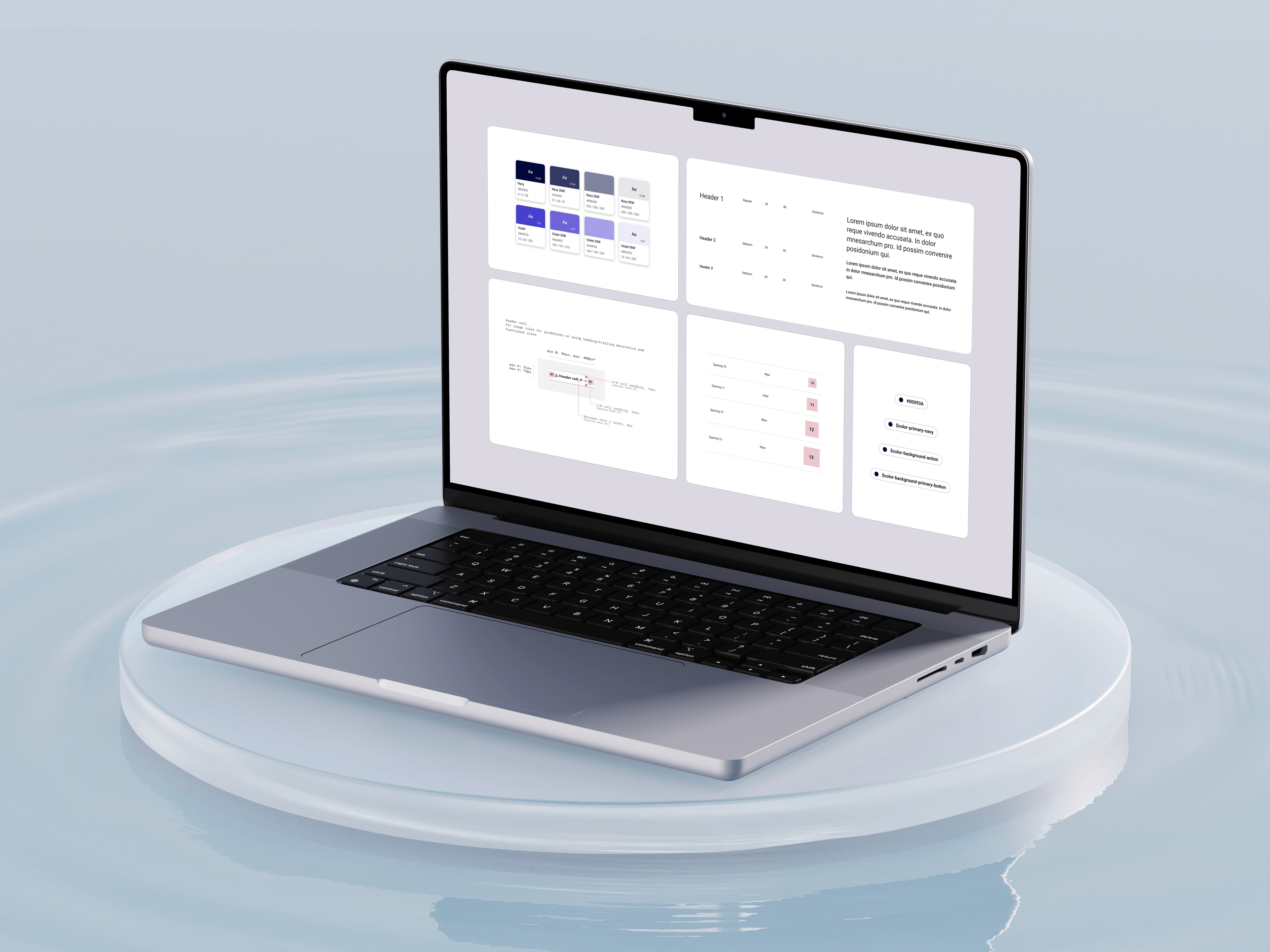
As CMHC transitioned from Sketch to Figma, I scaled the enterprise workspace and led the 0-1 creation of their new design system while aligning it with their evolving brand identity— developing new foundational & component libraries, design tokens, and comprehensive guidelines.
In addition, CMHC was transitioning towards an agile methodology, to further assist the transition I developed documentation outlining best practices for working with designers, developers, and QA teams, ensuring smooth collaboration and integration within the new workflow. This foundational work established a scalable, unified design ecosystem for the organization.
Design Ops Playbook
Design Ops Playbook


Figma libraries to support
web & mobile components
Figma libraries to support web & mobile components
Web (React) & Mobile Libraries
Web (React) & Mobile Libraries
Web and Mobile libraries were created, delivering multiple benefits to designers, including reduced file size, a well-structured library for focused design needs, improved analytics tracking, and an optimized variant panel.
Custom components & variables
Custom components & variables
Digital users leveraging library
Digital users leveraging library
Implementing comprehensive
design guidelines for all
Optimize user experience by comprehensive guidelines
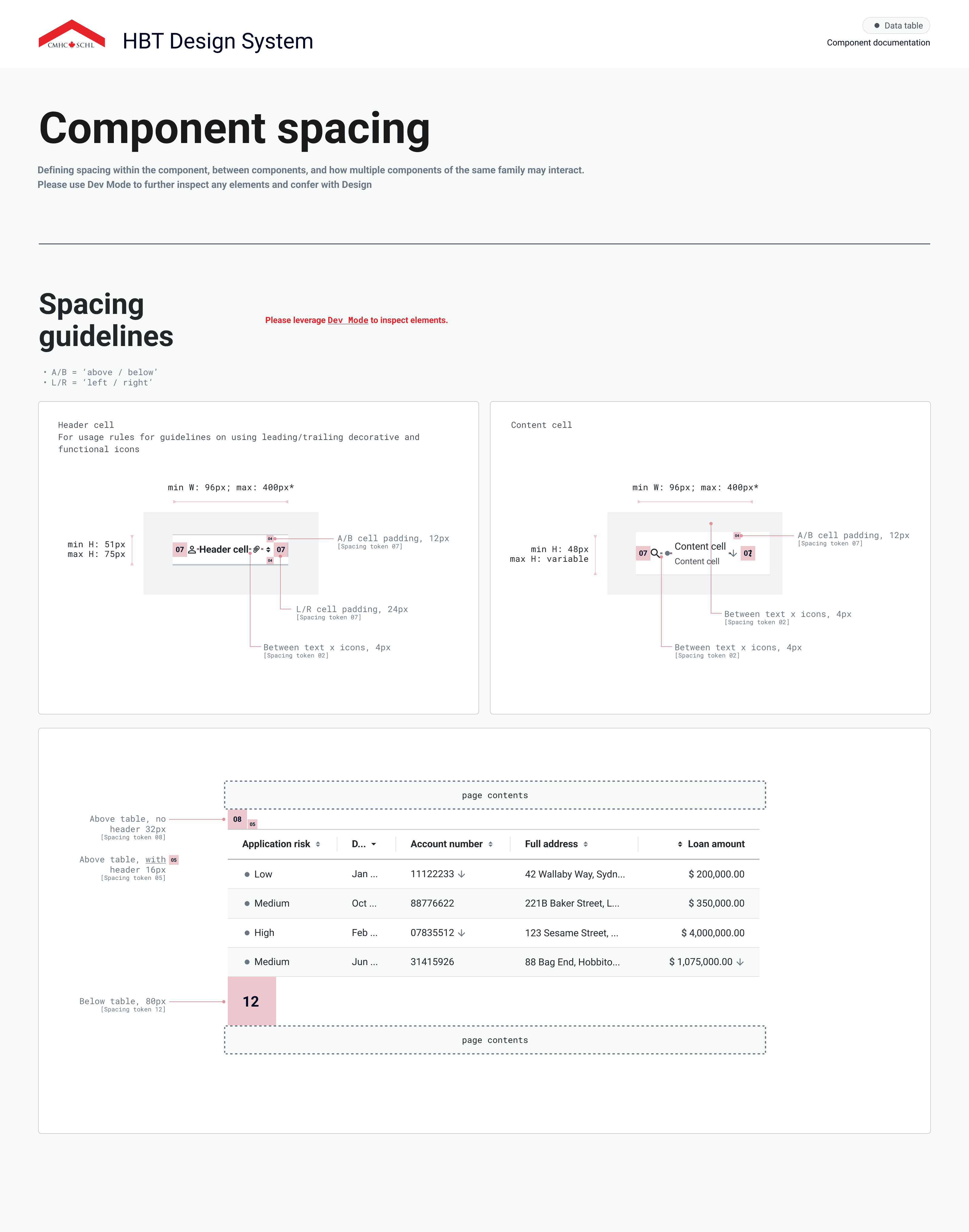
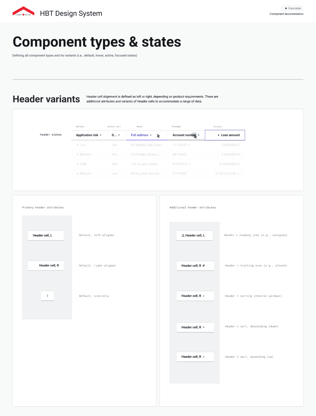
Hundreds of digital teams use HBT on a daily basis, including product designers, developers, BAs / PMs and QA. Providing comprehensive documentation is critical towards ensuring the design system can be implemented effectively, and improves comprehension between the partnering team members who use it. Our guidelines include detailed specifications about the master components, variants, property specifications, spacing, types / states, rules, and accessibility.
Hundreds of digital teams use HBT on a daily basis, including product designers, developers, BAs / PMs and QA. Providing comprehensive documentation is critical towards ensuring the design system can be implemented effectively, and improves comprehension between the partnering team members who use it. Our guidelines include detailed specifications about the master components, variants, property specifications, spacing, types / states, rules, and accessibility.


Designing for accessibility & inclusitivity
Designing for accessibility
& inclusitivity
Designing for accessibility & inclusitivity
Focus State
Focus State
Button
Keyboard Controls
Keyboard Controls
Tab
Tab
Tab
Tab
Q
Q
Q
Q
Shift
Shift
Shift
Shift
Z
Z
Z
Z
Colour Contrast
Colour Contrast

WCAG AA: Pass
Screen Reader

HBT upholds high accessibility standards to ensure our digital products are usable by all user groups across Canada. To meet the latest requirements our design system team collaborates closely with a dedicated accessibility SME throughout the system’s development.
Accessibility within the design system encompasses various aspects, including adequate colour contrast ratios, keyboard navigation, screen reader compatibility, and focus states. To promote accessible design practices, HBT integrates accessibility criteria directly into Figma documentation for each component, providing clear guidelines to enhance awareness and adoption.
Governance & scaling the system
Governance & scaling the system
Collaboration Process
Token Library

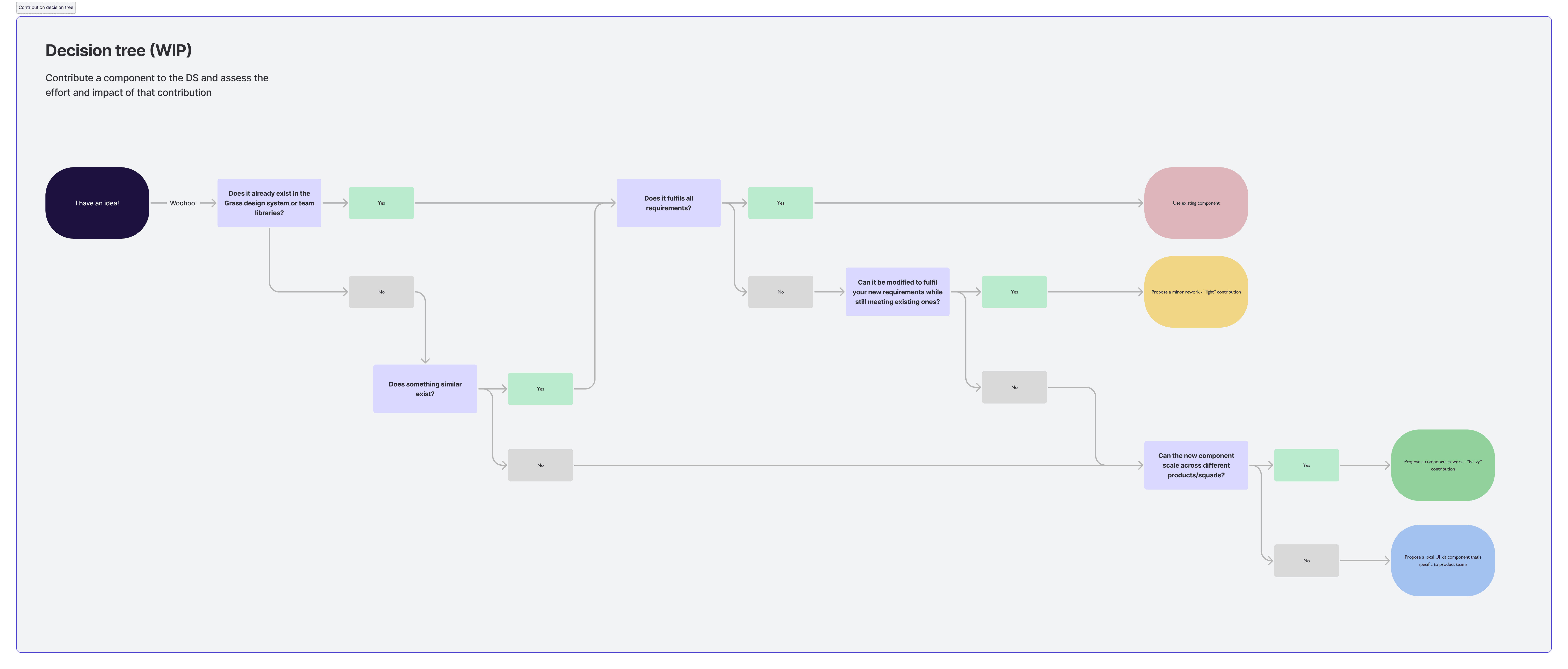
The design team leverages a contribution model to scale up the design library among designers and developers when the need arises. This methodology allows our team to bridge the gap between existing and proposed components to meet our teams needs.
As the HBT teams resources are split between design systems and product delivery, this methodology allowed us to be an extension of the product teams ensuring that system governance and quality is met, rather than being the sole individuals who build and maintain the library. Setting up collaboration processes and contribution guidelines enables more teams to participate and scale up the design system as the organizations needs grow.
To further scale the library, a token library was created allowing for the management of different themes and branding elements than can be centrally managed. As various lines of businesses have evolving branding and customized styling elements - it can be scaled easily by the design team.
Collaboration & community
Collaboration & community

Weekly retro

Design team stand ups

Weekly demos

Developer Sync

MS Teams channel

Accessibility SME

Design system onboarding
The HBT team established various design rituals and resources to coordinate efforts strategically across product teams. The team hosted daily stand ups to align on tasks, blockers, and brainstorm solutions to work. In addition, our team held onboarding and training sessions to ensure new team members had the resources to be successful on the project.
Cross collaboration and communication with the development team was crucial to ensuring successful implementation of HBT. Our team regularly organized developer sync touch-points and demos to stay informed on our partners work and answer any questions that arose.
A teams channel was created to offer designers & developers continuous cross-functional support and the ability to quickly get in contact with team members or set touch points. The team used Azure DevOps to ensure transparency and access to to any information throughout the project.
©2025 - Jon Kerr
Back to top
©2025 - Jon Kerr
Back to top
©2025 - Jon Kerr
Back to top
©2025 - Jon Kerr
Back to top