
Accenture
Lead Product Designer | Consultant
2022 - 2025
Clearmatter
Principal Designer | Consultant
2020 - Present
CIBC
UX Designer
2019 – 2020
University of Toronto
Graduate Research Student
2019
First Canadian Title
UX Designer
2017 – 2018
Ministry of Economic Development
Research Analyst
2016
University of Waterloo
Visual Designer
2016
Prica Global
Marketing & Sales Associate
2015
University of Toronto
Master of Information Science
2018 - 2020
HCI - Design & Data Science specializations
University of Waterloo
Bachelors, School of Planning
2013-2018
Urban Design & HCI specializations
Charles III University of Madrid
Erasumus
2017
Business & Film specializations


2 final concepts ready for unmoderated A/B testing to validate that we were making the right changes.
Six user groups were identified for our round of testing to understand the behaviour of customers who make routine purchases and how we can increase the mobile app usage based on patterns we identify.
It was confirmed in all test groups that current Tims app users will add a credit card to use the new Scan & Pay feature.
Majority of Tim Card users, chose to prefer using this function over adding a payment method. This helped us get closer to our end goal of wanting to introduce a new feature with minimal mental model shifts for our guest with added convenience.
/
Participants were very likely to use their mobile app with Scan & Pay toggled on
/
Participants successfully activated the scan & pay feature in prototype B whereas all users successfully completed it in prototype A
/
Tim Card only users prefer to continue using Tim Card as their payment method of choice in-store and for mobile purchases
/
Participants prefer prototype A with a separate tab for Tim Card, equally preferred regardless of current payment preference (in-store or mobile)
Participant Feedback
Frictionless
I wont forget to earn points when paying with a card from now on
Known Behaviour
QR usage has become more familiar during the pandemic, i don't see an issue with this approach
Ease
Taking a 2 - step process into a single-step process is going to make my day better
Save Time
" It's just faster, that's a no-brainer. I don't know why Tim Hortons hasn't done it already "
Remove editing defaults on the payment methods page as there is low traction of users coming to this page to set their default card (approx. 0.9% of users perform this action in the current state).
Instead, keep last used payment method as the user's default card for scanning and mobile orders. Most users (less than 5%) are actively known to change default settings, and if they were to change defaults, they would most likely be changing it during a transaction flow such as in the checkout or scan page.
Adding smart defaults such as defaulting to Apple/Google pay during checkout will reduce cognitive load on users.

People tend to work harder and faster when they're given artificial advancements for an incentive, think of it as a promise of a future reward. To gamify the old school challenges present on the app, we used this behaviour tool to design a progress tracker on the challenge card to motivate users to work harder and faster to finish a challenge and earn points.
This design change led to users being able to see a jump start towards achieving their goal, easily track their progress, and understand how much commitment is required. Overall, the holistic changes made to offers & challenges in the app contributed to the 2% increase in offer performance.
HBT Design System
HBT is the foundation of CMHC for elevating beautiful, standardized, and accessible designs and front-end digital products from our communities into reusable elements, promoting autonomous and collaborative culture to nourish a unified design system.
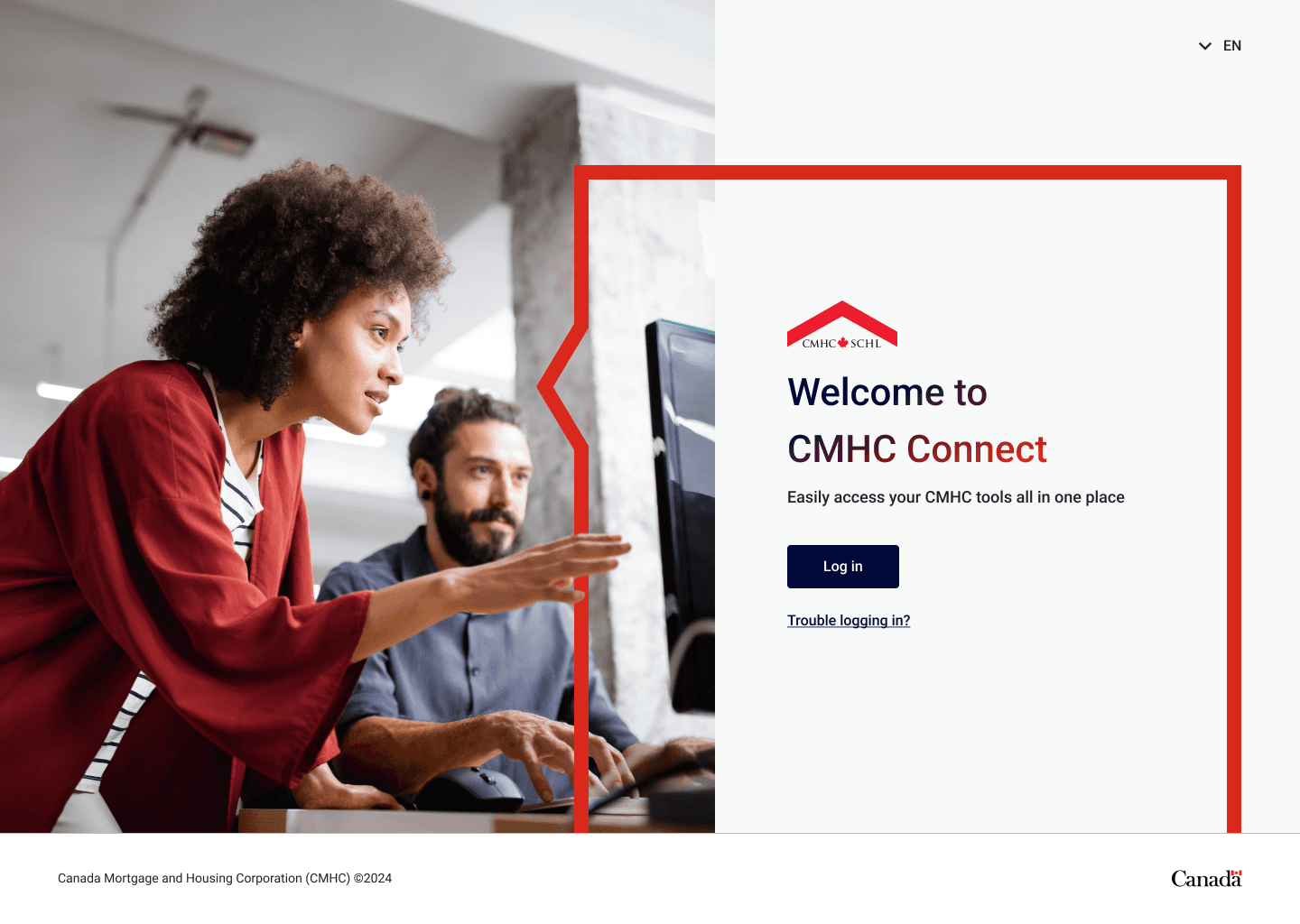
Client
Canada Mortgage and
Housing Corporation (CMHC)
Year
2024
Role
Principal Designer
Team
Design Director
Principal Designer
2 Senior Designers
2 Junior Designers
Product (PM / PO)
Engineering
Overview
Products using HBT


HBT Design System
How we did it…
Shaping how designers work
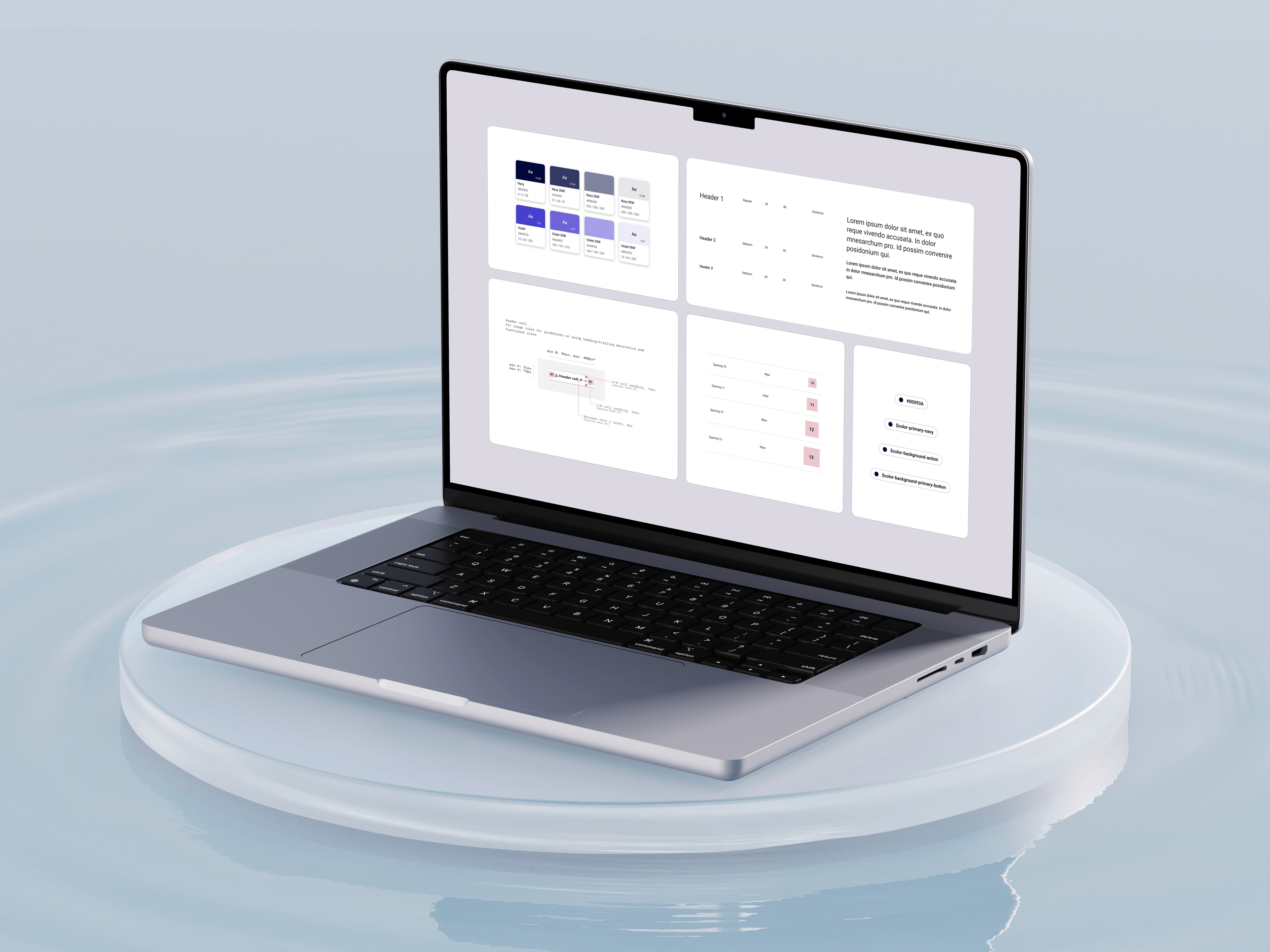
As CMHC transitioned from Sketch to Figma, I scaled the enterprise workspace and led the 0-1 creation of their new design system while aligning it with their evolving brand identity— developing new foundational & component libraries, design tokens, and comprehensive guidelines.
In addition, CMHC was transitioning towards an agile methodology, to further assist the transition I developed documentation outlining best practices for working with designers, developers, and QA teams, ensuring smooth collaboration and integration within the new workflow. This foundational work established a scalable, unified design ecosystem for the organization.
Design Ops Playbook


Figma libraries to support
web & mobile components
Web (React) & Mobile Libraries
Web and Mobile libraries were created, delivering multiple benefits to designers, including reduced file size, a well-structured library for focused design needs, improved analytics tracking, and an optimized variant panel.
Custom components & variables
Digital users leveraging library
Implementing comprehensive
design guidelines for all
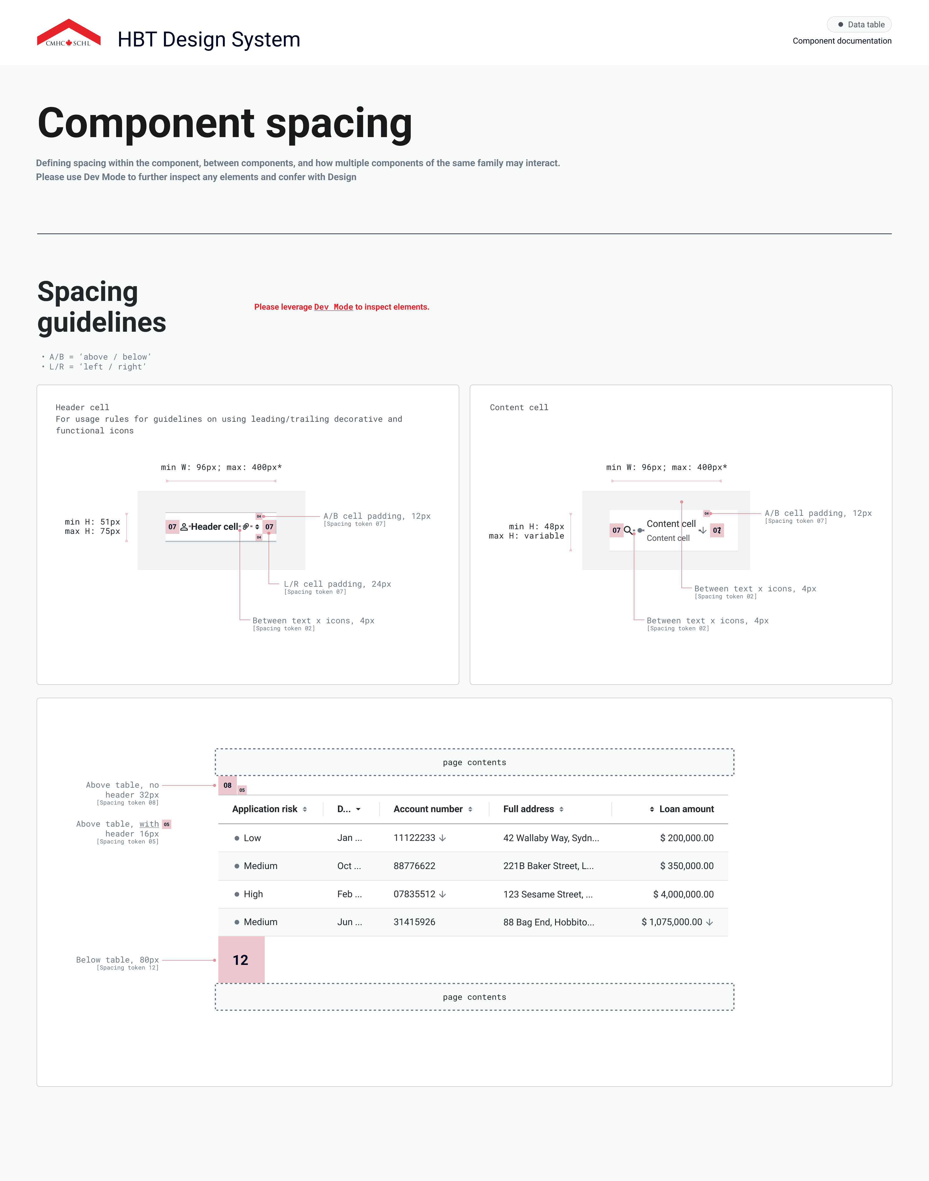
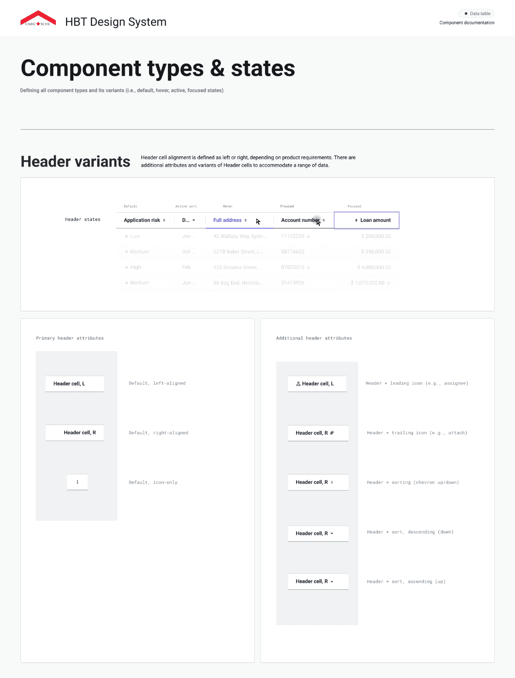
Hundreds of digital teams use HBT on a daily basis, including product designers, developers, BAs / PMs and QA. Providing comprehensive documentation is critical towards ensuring the design system can be implemented effectively, and improves comprehension between the partnering team members who use it. Our guidelines include detailed specifications about the master components, variants, property specifications, spacing, types / states, rules, and accessibility.


Designing for accessibility & inclusitivity
Focus State
Button
Keyboard Controls
Colour Contrast

WCAG AA: Pass
Screen Reader

HBT upholds high accessibility standards to ensure our digital products are usable by all user groups across Canada. To meet the latest requirements our design system team collaborates closely with a dedicated accessibility SME throughout the system’s development.
Accessibility within the design system encompasses various aspects, including adequate colour contrast ratios, keyboard navigation, screen reader compatibility, and focus states. To promote accessible design practices, HBT integrates accessibility criteria directly into Figma documentation for each component, providing clear guidelines to enhance awareness and adoption.
Governance & scaling the system
Collaboration Process
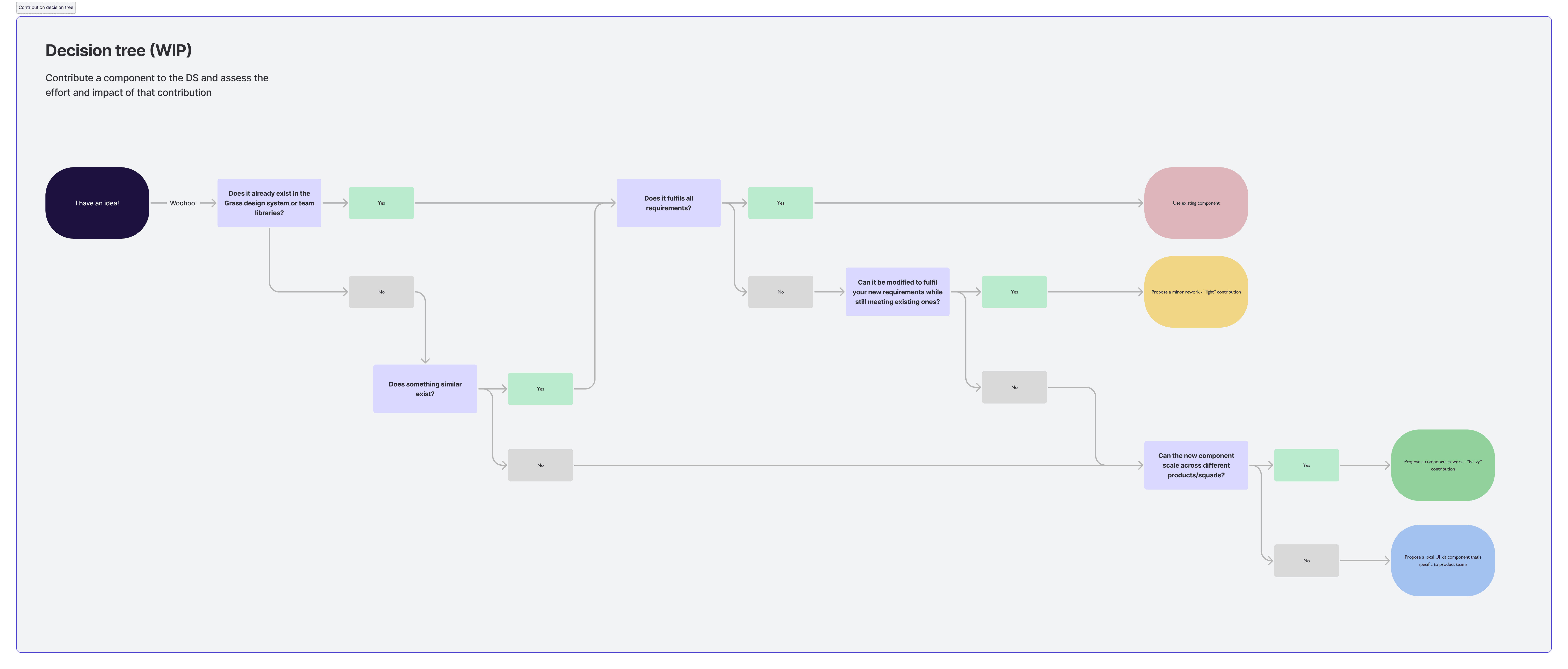
Token Library

The design team leverages a contribution model to scale up the design library among designers and developers when the need arises. This methodology allows our team to bridge the gap between existing and proposed components to meet our teams needs.
As the HBT teams resources are split between design systems and product delivery, this methodology allowed us to be an extension of the product teams ensuring that system governance and quality is met, rather than being the sole individuals who build and maintain the library. Setting up collaboration processes and contribution guidelines enables more teams to participate and scale up the design system as the organizations needs grow.
To further scale the library, a token library was created allowing for the management of different themes and branding elements than can be centrally managed. As various lines of businesses have evolving branding and customized styling elements - it can be scaled easily by the design team.
Collaboration & community


The HBT team established various design rituals and resources to coordinate efforts strategically across product teams. The team hosted daily stand ups to align on tasks, blockers, and brainstorm solutions to work. In addition, our team held onboarding and training sessions to ensure new team members had the resources to be successful on the project.
Cross collaboration and communication with the development team was crucial to ensuring successful implementation of HBT. Our team regularly organized developer sync touch-points and demos to stay informed on our partners work and answer any questions that arose.
A teams channel was created to offer designers & developers continuous cross-functional support and the ability to quickly get in contact with team members or set touch points. The team used Azure DevOps to ensure transparency and access to to any information throughout the project.
Example Template


Any Questions?